Take a walk down any FMCG aisle in Mumbai, Delhi, or Bangalore, and you’ll notice something changing. For years, packaging design trends in India focused on flashy illustrations, vibrant gradients, or minimal Western aesthetics.
But in 2026, the script has flipped—literally.
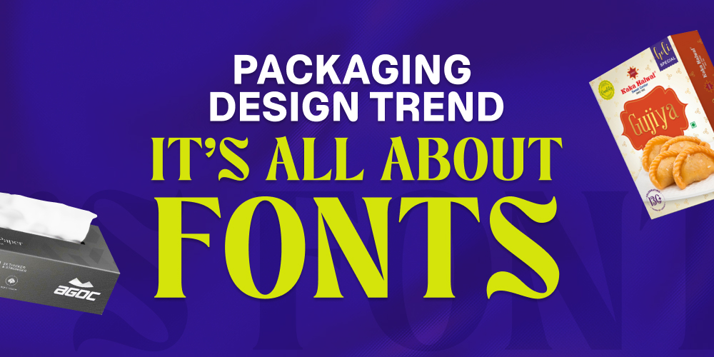
The most powerful tool in a brand’s visual identity is no longer just the logo or graphics—it’s the font. Typography has moved from the background to the forefront, becoming the defining element of modern packaging designing in India.
At Bright Pixel, we are witnessing a major shift in how Indian consumers interact with packaging. Here’s why typography-led packaging design is dominating FMCG shelves and why your brand needs to adapt.
What is Expressive Typography in Packaging Design?
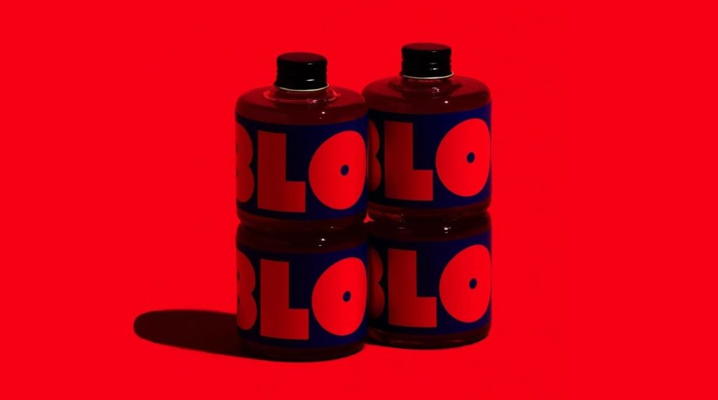
We are moving away from generic, overused fonts like Helvetica and Arial. Today, brands are embracing expressive typography—fonts that have personality, emotion, and a distinct voice.
Whether it’s a bold serif for a snack brand or a clean, premium typeface for skincare, typography is now doing the storytelling that visuals once handled.
In India’s highly competitive retail environment, brands have just 1–2 seconds to capture attention. A unique font acts as a powerful visual hook, instantly communicating whether a product is luxury, organic, fun, or bold.
Why Indian are Brands Using Regional Fonts in Packaging?
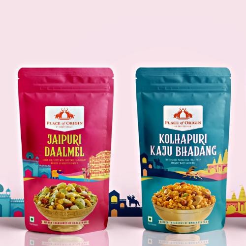
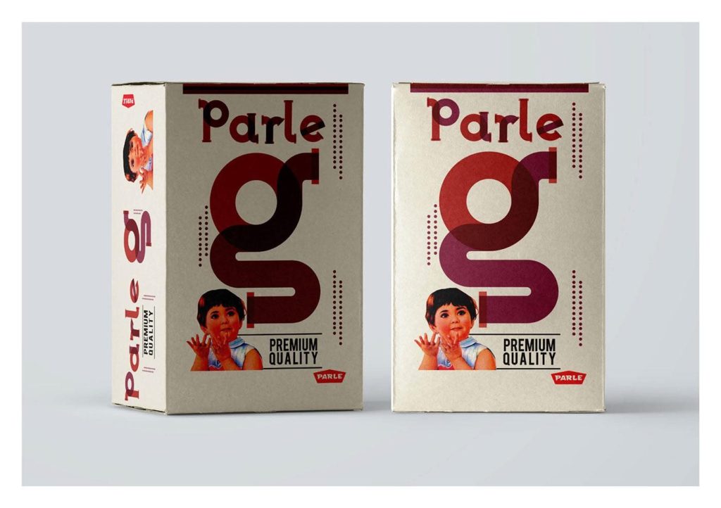
India’s diversity is its biggest strength, and brands are now leveraging it through Indic typography.
Instead of simply translating English into Hindi, Marathi, or Tamil, brands are designing custom regional fonts that align with their brand identity. This creates a strong emotional connection with local consumers.
Typography in regional scripts signals authenticity and trust—it tells the customer:
“This brand understands you.”
This trend is becoming a key driver in packaging design trends in India, especially in FMCG and D2C brands.
How Does Typography Improve Packaging Readability?
Modern Indian consumers are more aware and label-conscious than ever. They actively check ingredients, benefits, and claims before making a purchase.
This has led to a rise in:
- Bold typography
- High-contrast fonts
- Clear, oversized messaging
Key USPs like “No Added Sugar”, “100% Organic”, or “Dermatologically Tested” are now designed to be instantly visible.
Typography-led packaging improves readability, trust, and transparency, making it easier for consumers to make quick decisions. This approach also aligns strongly with Gen Z preferences, where bold minimalism, vibrant colors, and high-impact typography drive instant attention and shareability.
Why is “New-Age Vintage” Typography Trending in India?
One of the most exciting packaging design trends in India is the rise of nostalgic typography.
Brands are drawing inspiration from:
- Hand-painted Indian signboards
- Old cinema posters
- Traditional lettering styles
This “New-Age Vintage” approach blends heritage with modern aesthetics. It creates a sense of familiarity and authenticity—qualities that Indian consumers deeply value.
Typography plays a crucial role here, helping brands stand out while building emotional recall.
Why Typography Matters for Your ROI
Typography is no longer just a design choice—it’s a business decision.
Here’s how it directly impacts your brand performance:
- Brand Recall: A unique font makes your product recognizable even without a logo
- Shelf Impact: Bold typography cuts through visual clutter in retail stores
- Consumer Trust: Clear fonts improve readability and transparency
- Digital Performance: Strong typography works across E-commerce platforms, social media, and quick commerce apps
In short, better typography = better visibility + better conversions.
Ready to lead the packaging trend in India?
Visit: https://brightpixel.in/ and let’s transform your brand’s packaging journey.
People Also Ask: Packaging Design Trends in India
Typography-led design, bold fonts, regional scripts, and high-readability packaging are leading trends.
It improves brand recall, enhances readability, and helps products stand out instantly.
It focuses on fonts as the main visual element instead of heavy graphics or illustrations.
It involves using Indian regional languages like Hindi, Marathi, and Tamil in design to build local connection.
Fonts communicate brand personality quickly, helping consumers make faster choices.
Using bold, high-contrast typography and clear messaging improves shelf impact.