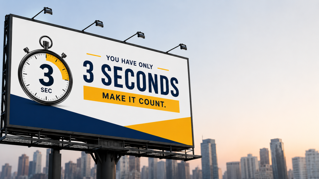
Drivers and commuters have roughly three seconds to absorb an outdoor advertisement before it disappears from view. At Bright Pixel, we help real estate developers, educational institutes, healthcare groups, and local retail chains transform fast-moving traffic into high-intent leads through strategic out-of-home (OOH) visual strategy.
Q1: Why do most outdoor hoarding designs fail to grab attention on busy streets?
Answer: Most billboards fail because they treat high-impact hoardings like print flyers, cramming multiple offers, long addresses, and secondary contact details into a single frame. On congested roads, visual clutter causes cognitive overload. Hoardings fail when they lack a clear focal point, suffer from weak color contrast, or use decorative typography that blurs at high speeds.
Q2: What is the optimal visual hierarchy and word count for a giant billboard?
Answer: A high-converting outdoor advertisement adheres to strict spatial principles:
The 7-Word Rule — Limit text to 6–7 words maximum so passing motorists digest the value proposition in one glance.
Single Visual Anchor — Feature one hero visual, such as an architectural render or focal product shot, that consumes 50% of the canvas.
Streamlined CTA — Position your brand logo and a high-contrast Call to Action (a single phone number or simple web URL) in the natural line of sight.
Q3: What is the optimal visual hierarchy and word count for a giant billboard?
Answer: A high-converting outdoor advertisement adheres to strict spatial principles:
The 7-Word Rule — Limit text to 6–7 words maximum so passing motorists digest the value proposition in one glance.
Single Visual Anchor — Feature one hero visual, such as an architectural render or focal product shot, that consumes 50% of the canvas.
Streamlined CTA — Position your brand logo and a high-contrast Call to Action (a single phone number or simple web URL) in the natural line of sight.
Q4: How do color contrast and typography differ between digital screens and printed hoardings?
Answer: Digital billboards utilize backlit RGB color profiles, whereas large-format printed flex hoardings rely on CMYK ink and ambient outdoor light. Printed designs require exaggerated visual contrast (such as bold yellow-on-black or white-on-navy) to combat midday glare and light scattering. Typography must use heavy, sans-serif fonts with wide kerning, as delicate serif fonts dissolve from a distance.
Q5: Why should you separate artwork printing from creative agency design?
Answer: Print vendors focus on ink application, vinyl thickness, and physical mounting — not marketing strategy or consumer psychology. Entrusting design solely to a printer often yields generic, low-converting layouts that waste prime media real estate for real estate, healthcare, education, and retail brands alike. A specialized design agency builds vector-scalable, strategically targeted creative artwork that protects your brand equity before sending print-ready files to vendors.
Q6: How can a Pune-focused design agency help local brands stand out on high-traffic corridors?
Answer: Heavy-traffic stretches like Hinjewadi, Baner, and Senapati Bapat Road present distinct viewing speeds and angle challenges. As a Pune-based agency, Bright Pixel understands regional commuter flow, local cultural cues, and corridor-specific visibility metrics. We engineer high-converting billboard designs for Pune’s competitive real estate, healthcare, education, and retail markets to ensure your campaign breaks through urban visual clutter.
Q7: What size hoarding is right for my location and budget?
Answer: Size should match viewing distance and traffic speed, not just budget. Highway hoardings with fast-moving traffic need larger, bolder formats since drivers have less time to register detail. City intersections with slower traffic can work smaller and more detailed, since commuters have more dwell time at signals. Bright Pixel sizes each hoarding around your specific corridor’s speed and visibility, not a one-size-fits-all default.
Q8: How long should a hoarding campaign run before you change the creative?
Answer: Most campaigns lose recall value after 4–6 weeks, as repeat commuters mentally tune out a design they’ve already registered. High-traffic corridors benefit from refreshing creative every 30–45 days. Seasonal or offer-driven campaigns should run for the length of the offer itself, not a fixed calendar cycle.
Q9: Do I need different creative for a digital hoarding vs. a static print hoarding?
Answer: Yes. Static hoardings rely on one strong visual and minimal text to land in a single glance. Digital hoardings can use motion, but each frame should still follow the 6–7 word limit, use simple cuts or fades instead of complex animation, and hold for 8–10 seconds so a glancing driver catches the full message. Simply animating a static layout rarely works well.
Q10: How much does professional hoarding design cost compared to using a print vendor's in-house design?
Answer: Vendor in-house design is usually bundled into printing costs but relies on generic templates, since the vendor’s priority is print-readiness, not conversion. Agency design costs more upfront but includes audience research and corridor-specific strategy. Since media space is the larger recurring cost, design fees are typically a small fraction of total campaign spend — and they decide whether that spend converts.
Conclusion
Bright Pixel has designed high-converting hoardings for real estate, healthcare, education, and retail brands across Pune’s busiest corridors — from Hinjewadi to Baner to Senapati Bapat Road. If your next campaign needs to work in three seconds or less, let’s build it right the first time.